Amazon

Mobile app
Created in collaboration with Maria Ortiz
MamaSkin is an all-in-one self-care app for expecting mothers, addressing skin-related issues during pregnancy using personalized routines and trusted, high-quality skincare products.

Timeline

6 weeks

Process

Research

Evaluation
Analysis Original App flowchart
User Testing on Original App

Ideate

Update Sitemap
Redesign Screen

Testing

User Testing on Redesign
Comparison

Conclude

correction Base on Feedback
Clickable Prototype

Why Amazon?

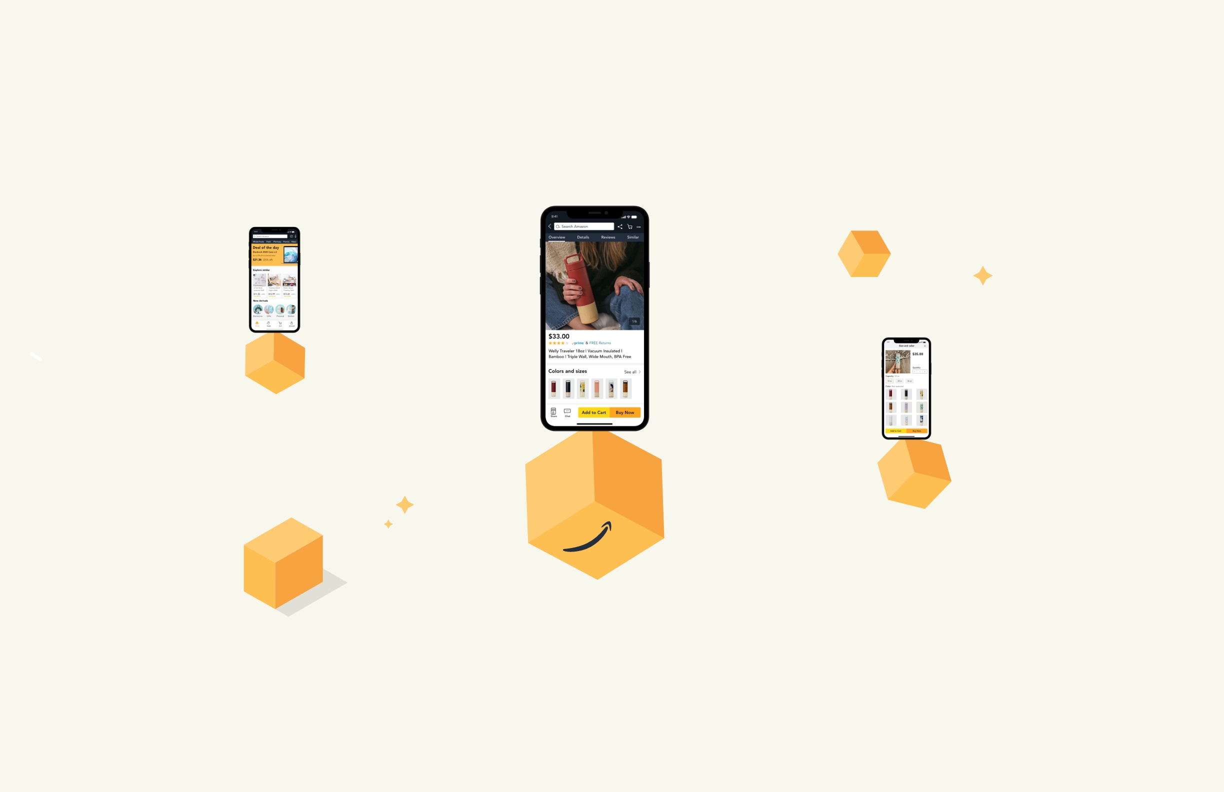
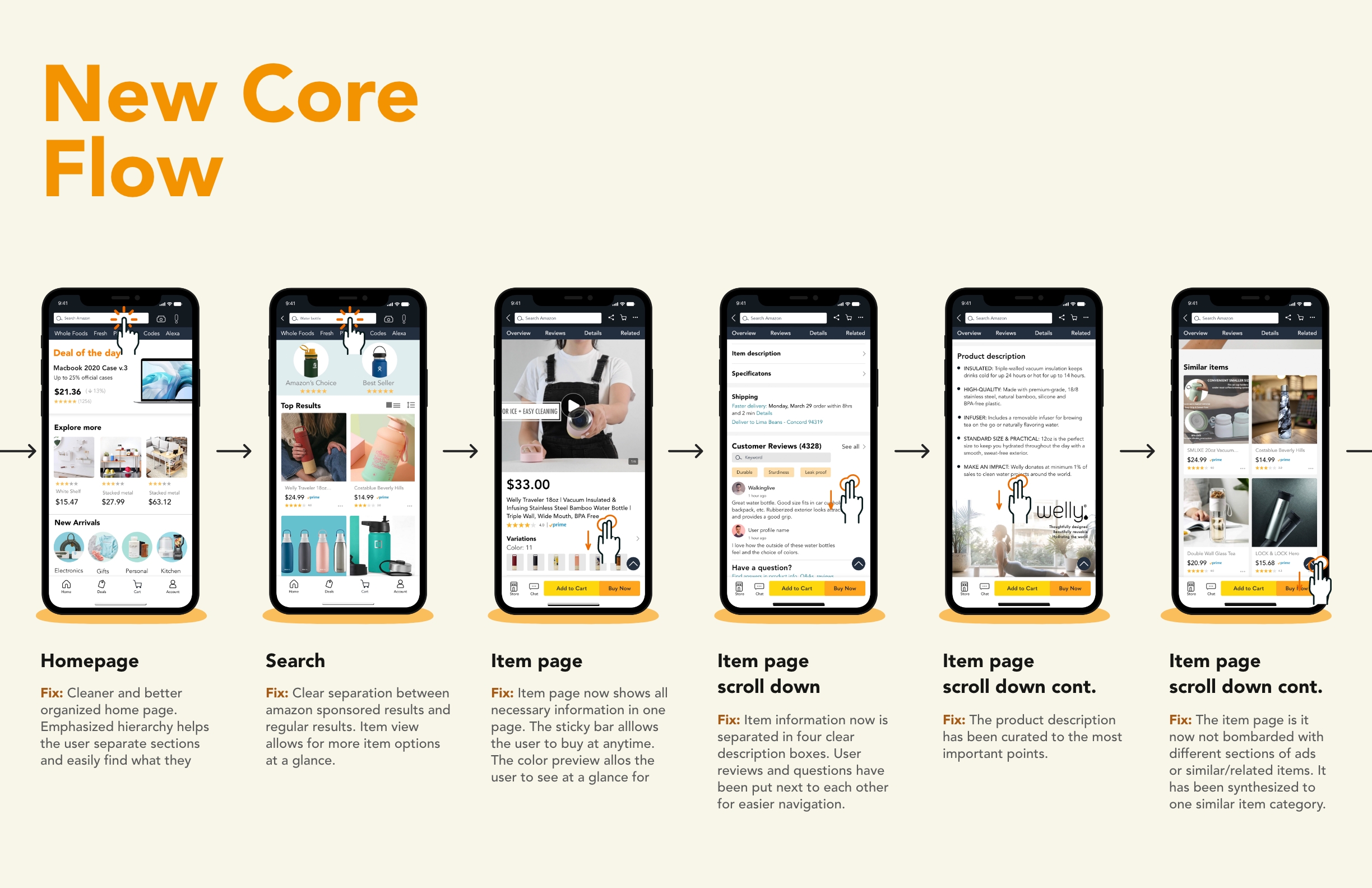
Amazon has become the app to go for any purchases. It gathers users from the crowdest cities to the most remote areas. Amazon fought its way to the top of the shopping apps by providing competitive prices, easy returns and anything you need a click away. 
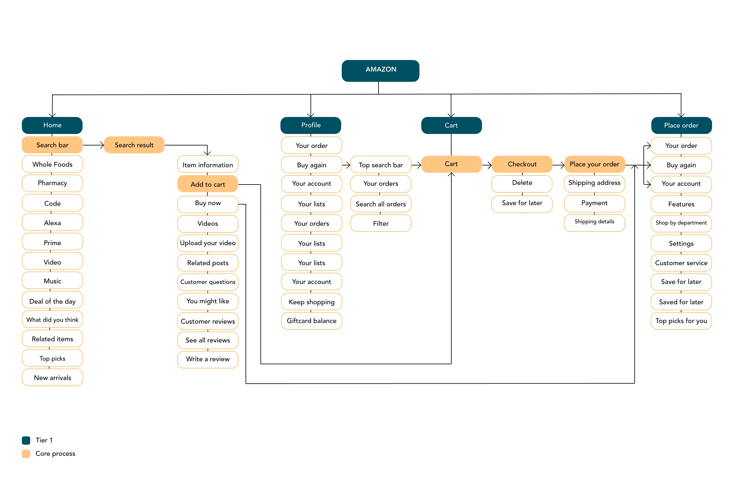
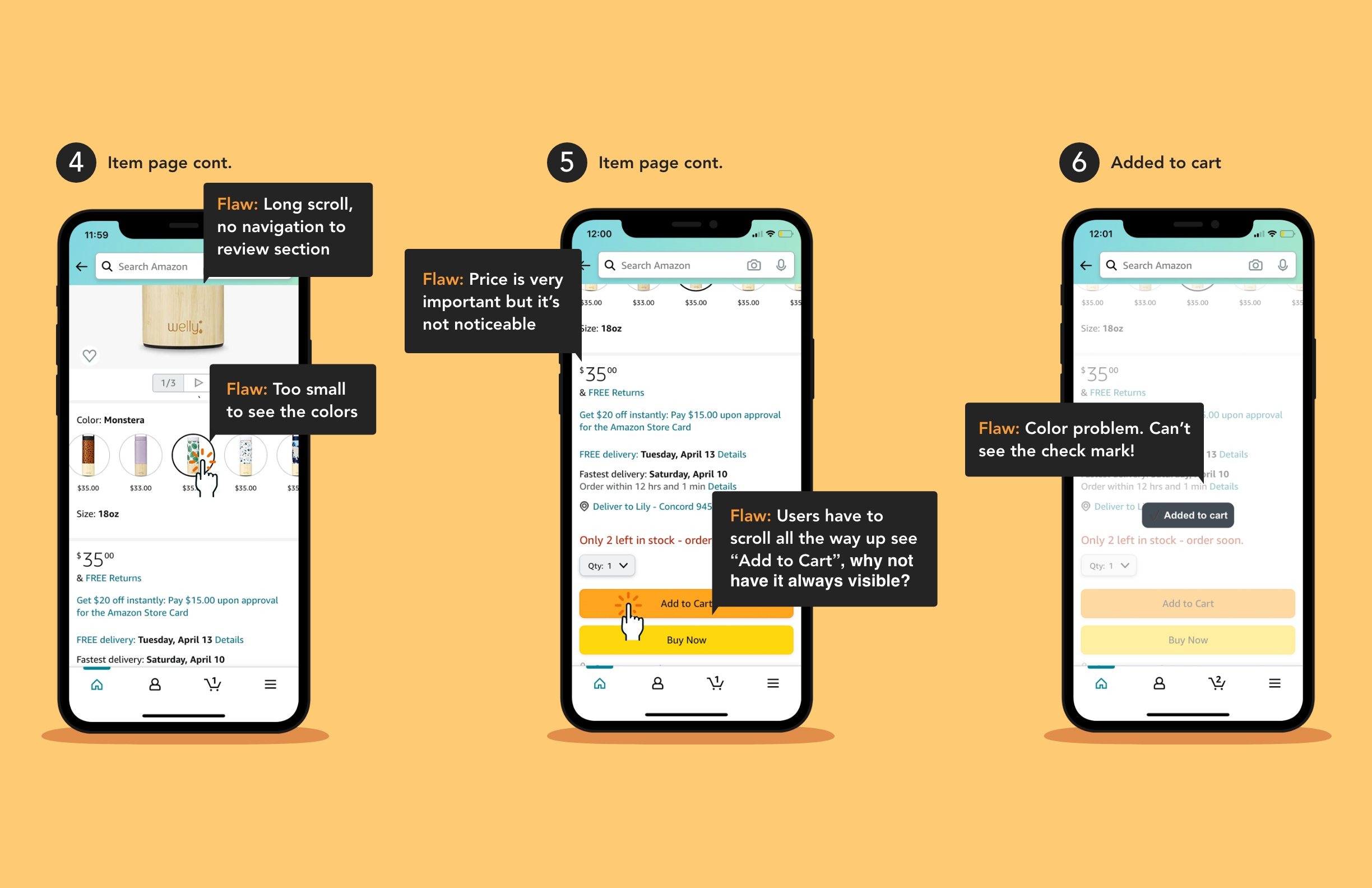
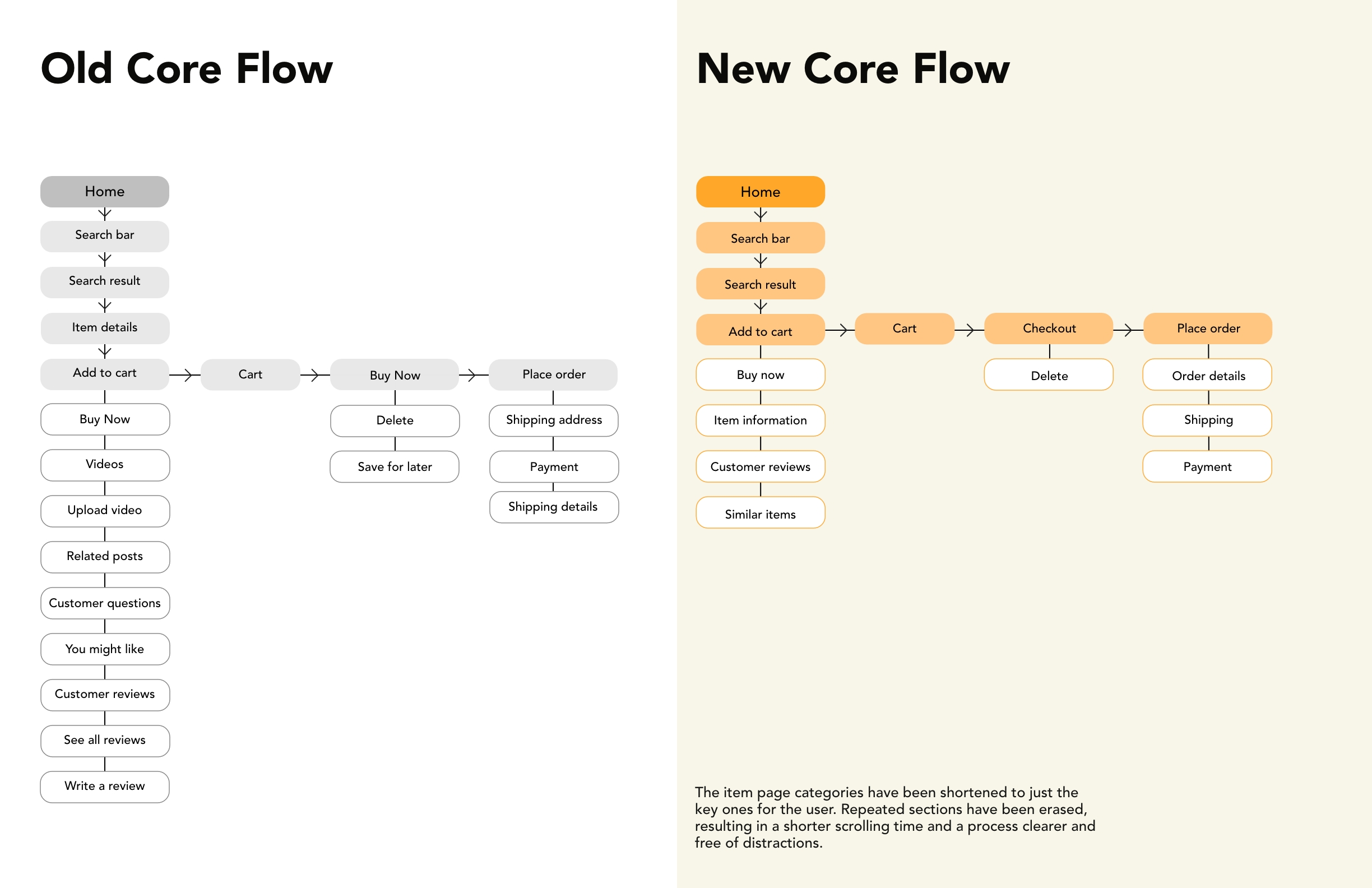
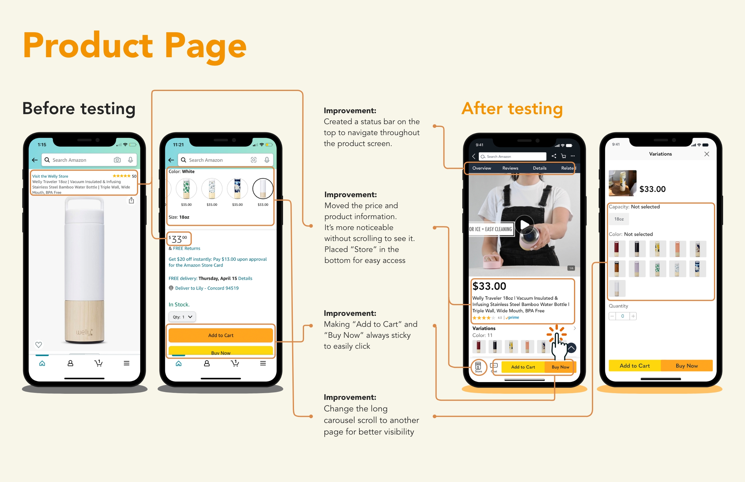
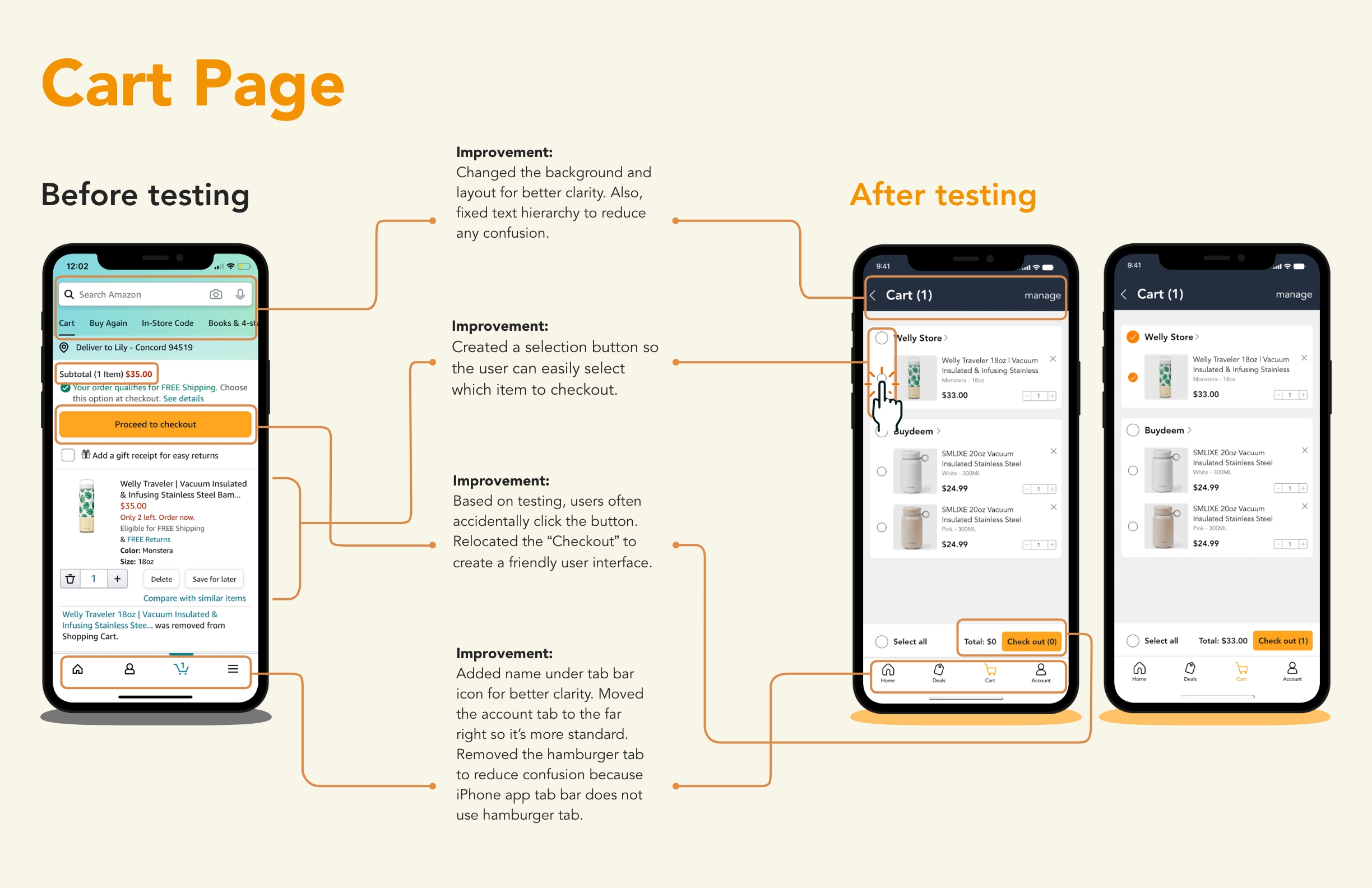
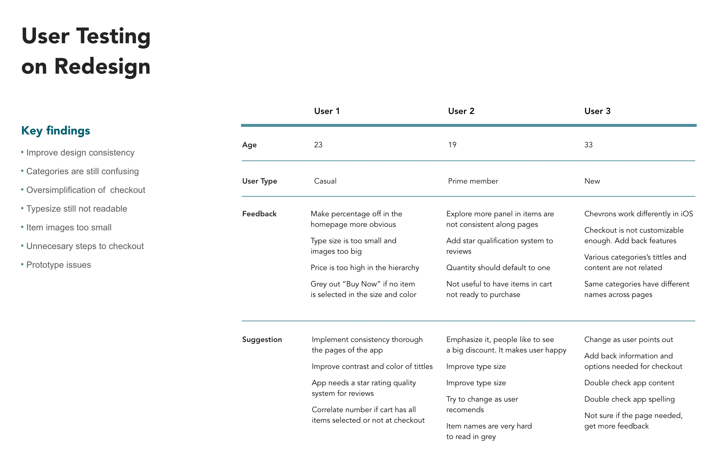
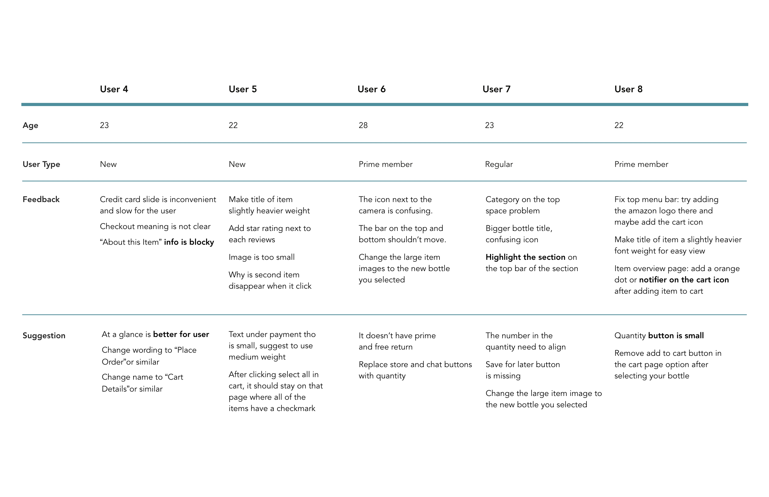
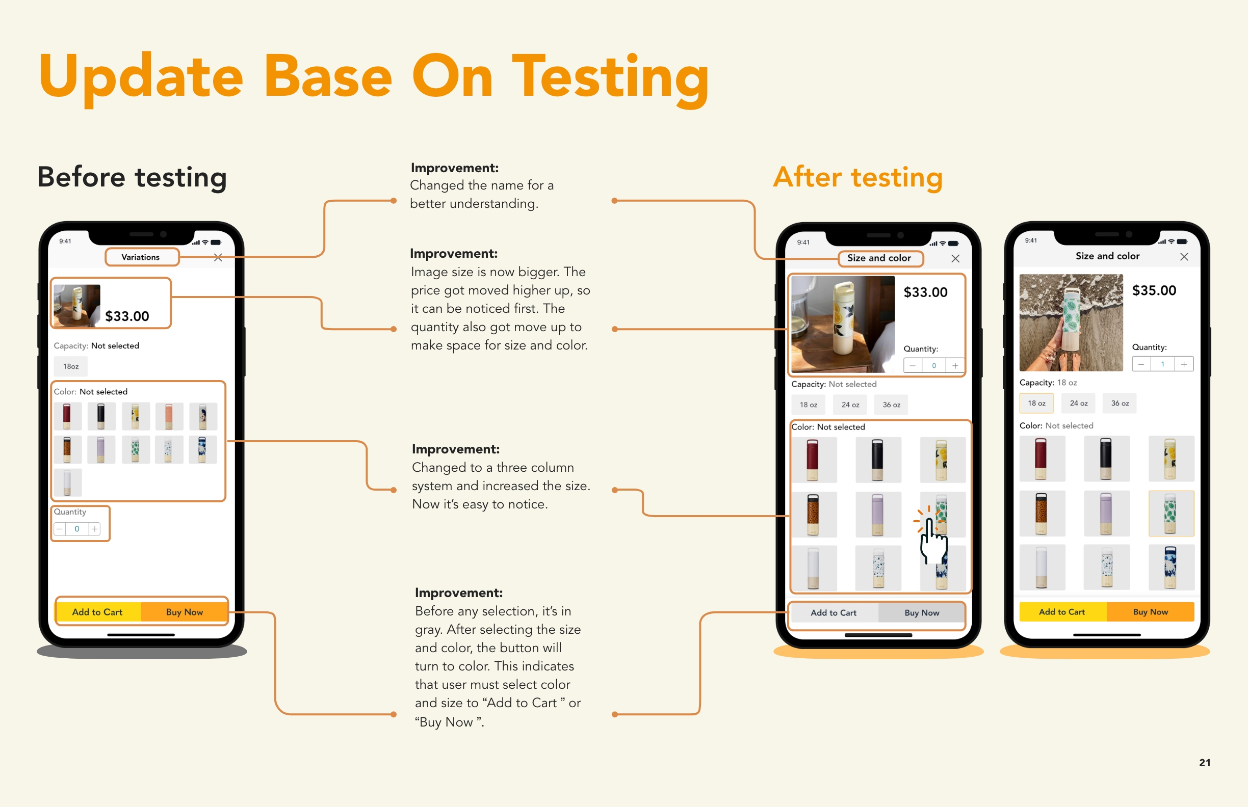
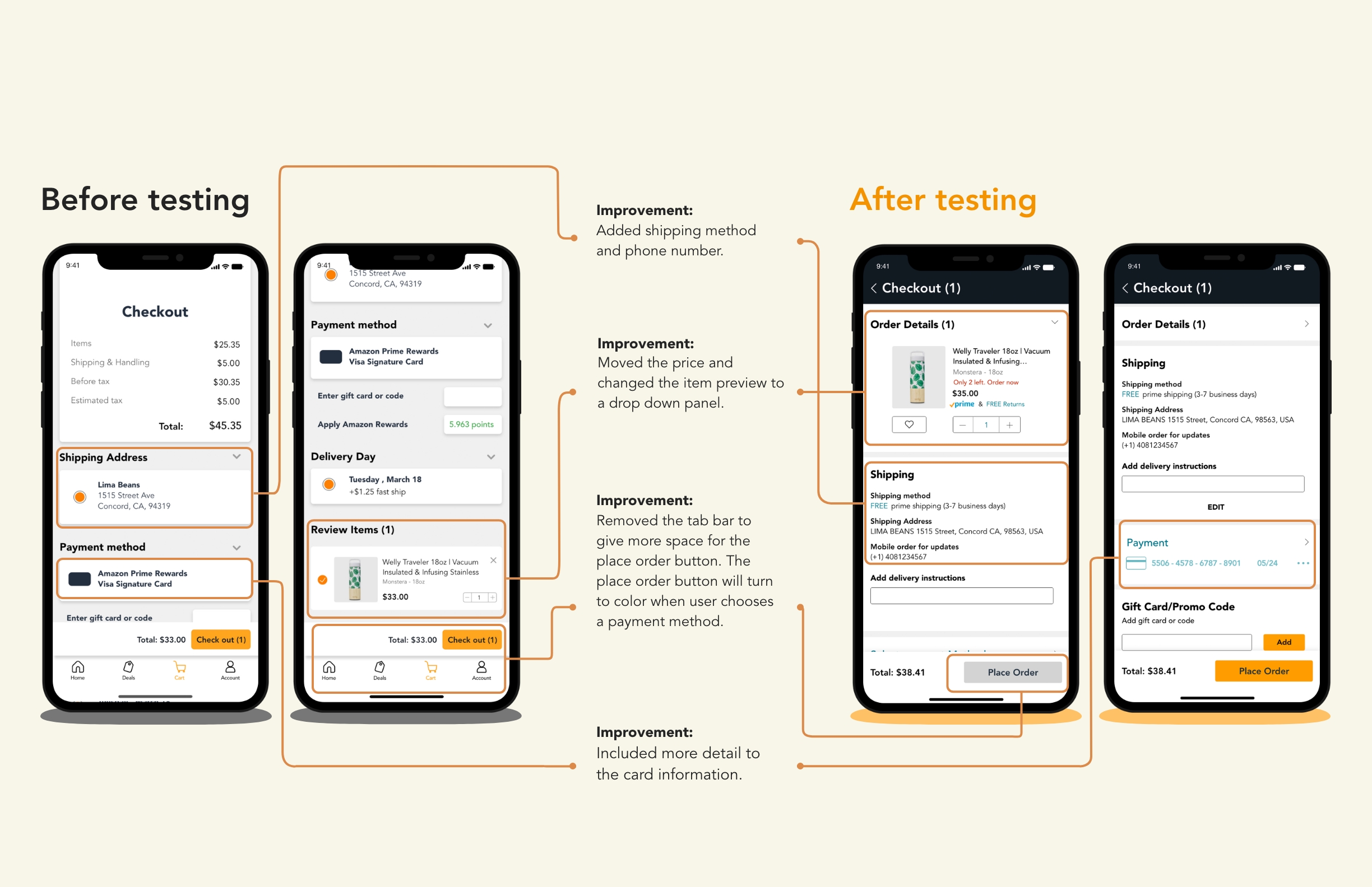
Even though Amazon is a top sales app, its design does not reflect it. It is unorganized, cluttered and stuck in the past. It holds the design of old and unsuccessful apps.

Upgrade Goal

To upgrade its core experience and screen design. Lima Beans will modernize the design and shorten the time of purchase.

Core process

To purchase a water bottle

First, our team has selected a specific core experience that will be improved. The experience is to purchase a water bottle, which is Amazon’s main purpose.

Homepage

I’m going to show you our core process prototype. Users will first enter the homepage. We want to search for a water bottle by clicking on the search bar. In this page, we list the items in a two column and we added an quick add button.

Product Page

We tackle on reducing the very long scroll by adding a bar on top for users to go to different section. Users then can click the arrow to go all the way up. We collected information about the item and organize the information in two area which is the item description and specification information.

Color and Size

Clicking on the colors and size will take the users to another panel because we really want the users to see the choices in a bigger scale. The users then need to select the size and colors in order to add to cart or buy now.

Checkout

At the cart, We came to a decision of added a check circle next to the item for user to select which item they want to check out because we believe it important to giving the user the space to think about what they to buy without going back and forth between the wishlist and cart.

Order Detail

When the user proceed to the checkout, users can double check the item in a drop down panel. Here, the place order button is in gray because users need to enter their payment method. We created a much more friendly and easy to understand payment UI such as different payment type with icon next to them which was not included in the original app.

Final Thoughts

In this project, I learn to understand our users, tie in those insights gained from research and implement our solution, as well as collaborate to work in team and decision making in what to keep and what to take out so that we can deliver a better solution for the business and our users.